 RailsGrowth
How To Organize ViewComponents in Rails

When you first start adding components like ViewComponents into an application, I think it's normal to start running basic commands like rails generate component Button as an easy starting point.
Very quickly, you'll find that /app/components/ fills up with dozens or hundreds of files, and they rarely organize themselves nicely.
I prefer to namespace components early on - usually in a shallow single folder structure.
Common ViewComponent Namespaces
Here are some examples of common folders I'll use. All of these will shift depending on the size of the app and what type of design system we're working on. Is it a CMS? SaaS app? eCommerce site? All of those will demand different setups.
UI Elements & Controls
/buttons/- Primary, secondary, icon buttons, button groups/forms/or/fields/- Form controls, input groups, field wrappers/inputs/- Text fields, selects, checkboxes, radio buttons. Sometimes I'll keep these in/fields//tables/- Data tables, sortable headers, pagination/navigation/- Navbars, breadcrumbs, tabs, sidebar menus/modals/- Dialog boxes, confirmations, overlays/dropdowns/- Select menus, action menus, context menus/alerts/- Success, error, warning, info notifications/badges/- Status indicators, counts, labels/icons/- SVG icons, icon wrappers, icon buttons
Depending on the number of these types of components, many of them also fit nicely into a /utilities/ namespace, eg Utility::AlertComponent.
Layout & Structure Components
Depending on the amount of layout components I'll start with a /layout/ folder, but for commonly used items like Cards or Sidebars I'll break out into separate folders.
/layouts/- Page layouts, grid systems, containers/cards/- Content cards, product cards, user cards/panels/- Collapsible panels, accordion sections/sections/- Page sections, content blocks/headers/- Page headers, section headers/footers/- Page footers, section footers/sidebars/- Navigation sidebars, filter sidebars/wrappers/- Generic container components
Content Display Components
Most of these fit nicely into an Elements namespace, eg Elements::IconListComponent, but can get broken out as they increase in complexity.
/lists/- Ordered, unordered, definition lists/media/- Images, videos, galleries, carousels/text/- Typography, headings, paragraphs, quotes/avatars/- User avatars, profile pictures/thumbnails/- Image thumbnails, preview cards/tags/- Content tags, category labels/progress/- Progress bars, loading indicators/charts/- Data visualization components
Interactive Elements Components
These sort of exist in between Layout and Utility and Elements namespaces and might deserve their own folders.
/tabs/- Tab navigation, tab content/accordions/- Expandable content sections/toggles/- Switch toggles, show/hide controls/tooltips/- Hover tooltips, help text/popovers/- Click-triggered content overlays/pagination/- Page navigation, item counters/search/- Search bars, filters, results/sorting/- Sort controls, order toggles
Application-Specific Components
I reserve these for design patterns that really don't apply outside of the model/product area that we're working on.
/dashboard/- Dashboard widgets, metrics cards/admin/- Admin-specific components/auth/- Login forms, registration, password reset/profile/- User profile components/settings/- Configuration forms, preference toggles/comments/- Comment threads, reply forms/notifications/- System notifications, alerts/messages/- Chat bubbles, message threads
Utility & System Components
These all fit well into a Utility namespace as well for simpler sites.
/loading/- Spinners, skeleton screens, placeholders/empty/- Empty state messages, call-to-actions/errors/- Error messages, 404 pages/confirmations/- Confirmation dialogs, delete warnings/skeletons/- Loading placeholders for content/overlays/- Background overlays, dimming layers
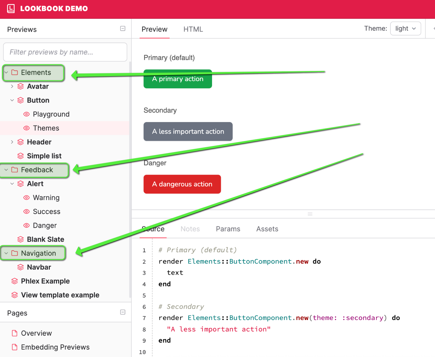
Lookbook Organization
Similar to our ViewComponents, I like to use namespaces in Lookbook previews as well.
Lookbook will automatically handle namespaced folders for objects like class Sidebars::SidebarContainerComponentPreview < ViewComponent::Preview
You can see this on the Lookbook homepage preview image:

![A Custom Outdated Gems Script to Speed Up Rails Dependency Upgrades [+ Video]](/content/images/size/w750/2025/07/outdated-gems-audit-example.png)
Comments